“`html
Why Your WordPress Form Disappears on Mobile
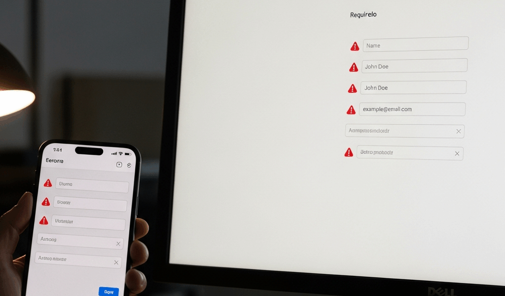
I spent three hours last month debugging a contact form that worked perfectly on my desktop but completely vanished when I opened it on my iPhone. The client was panicking — form submissions had dried up entirely. Turns out I was staring at a mobile rendering issue that desktop testing had completely masked.
WordPress form not showing in mobile view? Frustratingly common. Most troubleshooting guides skip past responsive design failures entirely and jump straight to plugin conflicts. Here’s what I discovered though: mobile form invisibility usually stems from one of three specific causes.
CSS Media Query Conflicts
Your theme or a custom CSS file contains a media query that hides form elements on small screens. This happens accidentally more often than you’d think. Someone wrote @media (max-width: 768px) { .contact-form { display: none; } } to hide something else, and the form got caught in the crossfire.
I’ve also seen forms disappear because of conflicting overflow: hidden rules — applied to parent containers on mobile. The form renders, sure. But its wrapper div refuses to expand beyond an artificially small height.
Plugin Viewport Conflicts
Older WordPress plugins don’t always respect the mobile viewport meta tag. When two form plugins both try to define viewport settings differently, the browser gets confused. Probably should have opened with this section, honestly — it trips up more people than the CSS issue does.
I encountered this with a client running WPForms alongside an ancient popup plugin from 2015. The popup plugin was forcing a non-responsive viewport, which broke WPForms’ mobile layout entirely.
Theme Mobile Breakpoint Misalignment
Your WordPress theme has a mobile breakpoint at 600px. Your form plugin expects breakpoints at 768px and 1024px. They speak different languages. The theme collapses the entire sidebar at 600px, but the form still thinks it has desktop-width space available.
This is common with hybrid themes — ones built five years ago and updated inconsistently. The responsive grid system doesn’t match modern mobile-first expectations anymore.
Clear Your Cache and Test on Actual Mobile Devices
Before doing anything else, flush everything.
Most WordPress sites run caching plugins like WP Super Cache, W3 Total Cache, or LiteSpeed Cache. These plugins cache your pages aggressively. If you made any recent changes, the cache is probably serving you outdated HTML that includes the broken form code.
Go to your WordPress admin dashboard. Using WP Super Cache? Click “WP Super Cache” in the left menu, then “Delete Cache.” W3 Total Cache instead? Find “Performance” and click “Empty All Caches.” LiteSpeed Cache? Look for “LiteSpeed Cache” and select “Purge All.”
Don’t skip this step. I learned this the hard way — spent two hours modifying CSS before realizing the cache was serving the original broken version.
Next, clear your browser cache. On Chrome, press Ctrl+Shift+Delete (Windows) or Cmd+Shift+Delete (Mac). Select “All time” and check “Cached images and files.” Click “Clear data.”
Now here’s the critical part: test on an actual mobile phone, not just browser responsive mode.
Chrome DevTools’ responsive design mode works for initial checks. It’s not a replacement for real device testing though. Browser emulation can’t replicate actual mobile browser rendering, network latency, or device-specific CSS interpretations. I’ve seen forms display perfectly in DevTools but vanish completely on an iPhone 12.
Pull up your WordPress site on your personal phone. Open it in Chrome, Safari, and Firefox if you can manage it. Look at the form. Does it appear? If yes, your issue is likely cache-related — problem solved. If no, you’ve confirmed the form actually doesn’t display on mobile, and we move forward with real debugging.
Check Your Form Plugin Mobile Settings
Different form plugins handle mobile responsiveness differently. You need to find the specific toggle for your plugin.
WPForms Mobile Settings
In your WordPress admin, go to WPForms → Settings. Click the “General” tab. Look for “Enable Responsive Design” or similar wording — it should be toggled ON. If it’s off, enable it immediately.
Then edit your specific form. Click “Design” in the form builder. You’ll see mobile preview toggles at the top — there’s usually a phone icon next to the desktop icon. Click the phone icon to see how your form looks on mobile. If fields are stacking weirdly or the form is cut off, WPForms has mobile-specific settings within the Design tab.
Look for “Container Width” settings. On mobile, this should be set to 100% or “Full Width,” not a fixed pixel value like 500px.
Contact Form 7 Mobile Responsiveness
Contact Form 7 doesn’t have built-in mobile toggle settings. Its responsiveness depends entirely on your theme’s CSS and the form’s HTML structure.
You can check if CF7 is even loading on mobile though. Edit your form in Contact Form 7’s form editor. Look at the HTML tab. Search for any conditional logic that might hide the form on mobile — look for phrases like [if mobile] or custom CSS classes that start with cf7-mobile-hidden.
CF7’s responsiveness largely depends on your theme. Jump to the “Fix CSS Conflicts with Inspect Element” section below to debug this properly.
Elementor Form Widget Mobile Settings
If you built your form with Elementor, open the page in Elementor’s editor. Click on your form widget. In the left panel, you’ll see responsive tabs — Desktop, Tablet, Mobile.
Click the “Mobile” tab. Check the form’s width setting. If it’s set to something like 80% with a fixed max-width of 600px, that’s fine. But if width is 0, hidden, or set to display: none, you’ve found your culprit.
Also check “Advanced” settings in the Mobile tab. Look for “Custom CSS” or “Visibility” settings. If visibility is set to “Hidden on Mobile,” toggle it to “Visible.”
Fix CSS Conflicts with Inspect Element
Grabbed by frustration, most people skip straight to plugin reinstalls. Here’s the better approach though: use Chrome DevTools to identify exactly which CSS rule is hiding your form.
On your mobile phone (or in Chrome DevTools mobile emulation mode), open your WordPress site. Long-press on your form area. Select “Inspect” or “Inspect Element.” The DevTools panel opens at the bottom.
You’re looking at the HTML. Find the form element — it’ll have a class like wpforms-container, wpcf7-form, or elementor-form.
Right-click on that element in the HTML inspector. Select “Edit as HTML” or just scroll through the CSS panel on the right side of DevTools. Look at the “Styles” section.
Common culprits appear here:
display: none;— The form is explicitly hidden.visibility: hidden;— The form is invisible but still takes up space.height: 0;— The container has zero height.overflow: hidden;combined with negative margins or padding.opacity: 0;— The form is transparent and unclickable.position: absolute; left: -9999px;— The form is positioned far off-screen.
Find which file that CSS rule is coming from. At the top of the Styles panel, you’ll see something like “style.css:512” or “plugin-name.css:45.” Click it. That’s your problematic file.
If it’s from your theme, go to WordPress admin → Appearance → Customize. Find “Additional CSS” at the bottom. You can add mobile-specific CSS to override the broken rule:
@media (max-width: 768px) {

  .wpforms-container { display: block !important; height: auto !important; }

}
If it’s from a plugin, you’ve isolated the problem. Document which plugin and which rule. This helps when you contact support or decide whether to disable that plugin entirely.
Switch Theme or Disable Plugins to Isolate the Issue
If the above steps haven’t worked, you need to determine whether the problem is theme-related or plugin-related. This sounds tedious, but it’s the most reliable diagnostic method available.
Start by switching to a default WordPress theme temporarily. Go to Appearance → Themes. Install “Twenty Twenty-Three” or another recent default theme if you don’t have one. Activate it.
Test your form on mobile again. Does it appear now? If yes, your original theme has CSS conflicts with your form plugin. You can reinstall your original theme and hire a developer to fix the CSS, or you can switch themes permanently.
If the form still doesn’t show, the issue is plugin-related. Switch your theme back to the original.
Now disable your form plugin temporarily. Go to Plugins → Installed Plugins. Find your form plugin (WPForms, Contact Form 7, etc.). Click “Deactivate.”
Your form will disappear from your site, obviously. But here’s what you’re testing: try a different form plugin. Activate “Gutenberg-native form block” or temporarily install a simple form plugin like “Simple Contact Form.” Does a different form plugin display correctly on mobile?
If yes, your original form plugin has compatibility issues. Contact their support, check for updates, or switch plugins.
If no form plugins display on mobile even after theme switching and cache clearing, something deeper is wrong. It might be a WordPress core issue or a server configuration problem. At this point, I’d recommend contacting your hosting provider’s support team.
Fallback option: Use WordPress’s native block form builder. In the block editor, search for “Form” and insert the Gutenberg form block. It’s basic — no fancy styling — but it’s responsive by default and doesn’t depend on plugins. This is a temporary solution while you troubleshoot the real issue.
Mobile form invisibility is solvable. Test methodically, clear caches religiously, and use your browser’s inspection tools like a detective. The answer is usually simpler than you’d expect.
“`




Stay in the loop
Get the latest web sme updates delivered to your inbox.